Product Designer / B2C
01
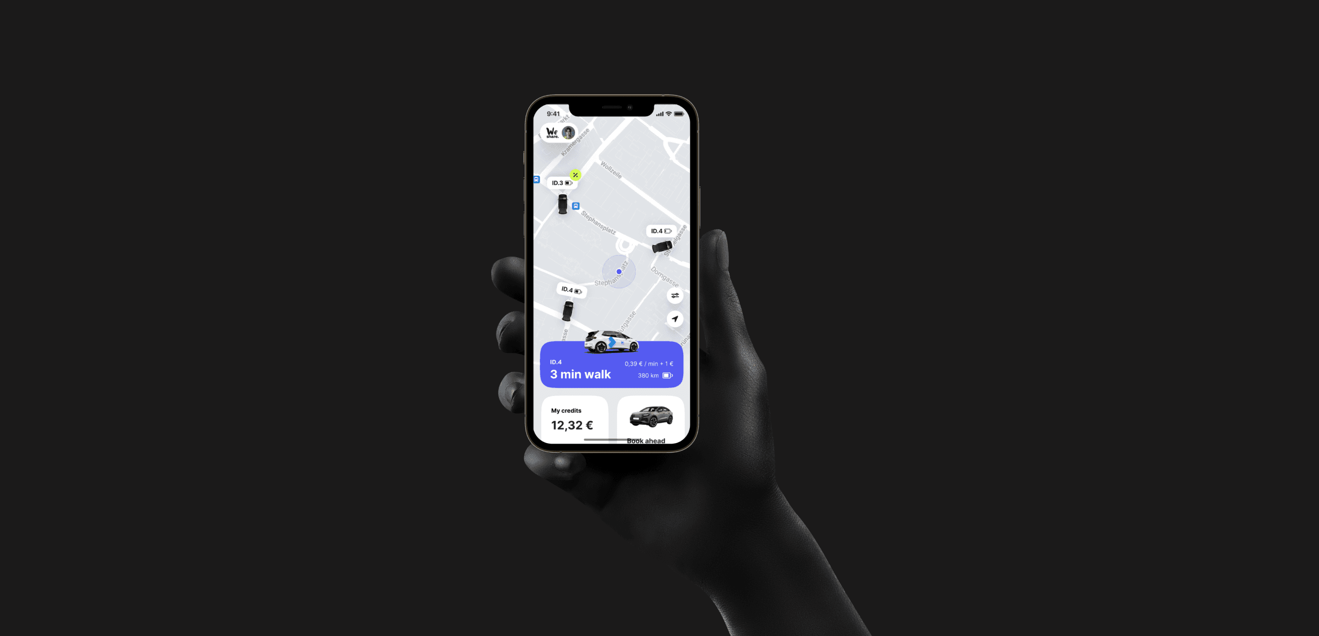
WeShare by Volkswagen
2022-2023
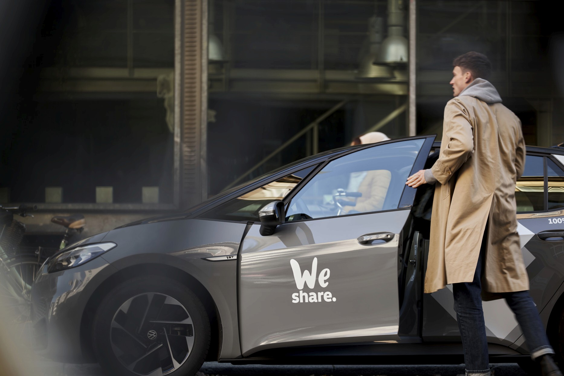
WeShare (a Volkswagen company) is a car-sharing service that has been making a positive impact on the environment and the lives of its customers since its inception.
Since its foundation, WeShare has saved almost 6,700 tons of CO2 with more than 6 million trips, and it has built a strong brand with over 200,000 customers in Berlin and Hamburg.
WeShare is proud to have demonstrated that 100% electric car sharing is possible, and through its service, many people have come into contact with e-mobility for the first time.
My role
I became a member of the Product Design Team at WeShare in June 2022, and have since been involved in developing the WeShare 2.0 app. This project involved a redesign of the existing app and incorporating additional offerings from Volkswagen, including car subscriptions, car-sharing, B2B services, and car rental through Europcar.
The problem
The design problem is not only to redesign but to create a multifunctional application, WeShare 2.0, that allows users to use Volkswagen's services seamlessly.

Additionally, the design must consider how to integrate the various services into the app in a way that is coherent and logical for the user.
Old design
The screenshot provided below displays the WeShare 1.0 screens. Upon reviewing these screens, it became apparent that my primary objective was to reassess the user flow and implement a new approach to the home-screen design.

Business requirements
In order to commence work on WeShare 2.0, I needed to acquire a comprehensive understanding of the business requirements and project scope. Fortunately, the product owners had already initiated a series of workshops to discuss these matters. The following are the primary features and flows that required modification or addition in WeShare 2.0.

Constraints and limitations
As with all product development, I encountered several constraints and limitations that needed to be taken into account. While some of these challenges were resolvable, the majority of them continued to impact my work in the future. Here are the main constraints and limitations that I encountered:

Home screen redesign
It quickly became apparent that the redesign of the home screen would be a top priority. The home screen of the WeShare 1.0 version was suitable for car-sharing services only. However, in the new version, there were many more features and functionalities that needed to be displayed to the user, as well as various content blocks that needed to be included. Thus, the home screen needed to be completely reimagined to accommodate these new requirements.

Car pin situation
It was determined that we needed to abandon the approach of showing the nearest car to the user on the map view. Instead, the map view and pins needed to display more comprehensive information, such as the car type, charging level, discounts, and incentives. This would provide users with a better understanding of the available options and help them make more informed decisions. I came up with these variants:

Design kick-off
To begin the redesign process, we organized a series of workshops where we could gather and brainstorm ideas to create low-fidelity initial screens for the home screen. These early designs were used to create initial prototypes that could be presented to the product owners, C-level executives, and Volkswagen managers for feedback and discussion.

Usability Testing
After completing the first prototypes, it was crucial to test them and gather feedback to improve the design. To accomplish this, we organized several online and offline testing sessions. After each session, we carefully assessed the results and made informed decisions about whether to continue with the current approach or make changes to the design.
Interview set-up
2 testing Teams (English & German)
Organized via testingtime.de
60 participants in total
No specific gender
Age 25-45 years

Key Data

What do our power users think?
During our usability test sessions, we also conducted user interviews to gather feedback on our new direction, offers, and app redesign. This proved to be a valuable source of information that helped us to understand the direction and make decisions on user flows, home screen, and visual design overall.

Final Results
In conclusion, I would like to present the final screens. The home screen's final approach was the result of several user testing sessions, as we iterated on the design based on the feedback received. We also worked on the content section and asked users about the sections they found most useful and in what order. This information helped us to improve the overall design and make it more user-friendly.

On-boarding
It became apparent that onboarding is crucial, as many users are not familiar with e-cars, and proper onboarding screens are essential for new e-mobility enthusiasts.

Pricing packages
Pricing packages changed too, the business profile was added as there are lots of B2B users that were using the product.

All in all
The prototype was based on the final design that we developed after conducting multiple rounds of user testing and interviews. We included detailed specifications for each design element, such as typography, color schemes, and iconography, to ensure that the final product would be consistent with the design vision. We also worked closely with the developers during the implementation phase, providing feedback and support as needed to ensure that the design was implemented correctly.
A huge thanks to everyone involved in the process from getting to go. In particular, I’d like to thank Loki English, Maximillian Bartl, Siniša Plevnik, Zeljko Stanojevic, Marian Sutholt, Dr. Stephan von Schorlemer, Mirko Schneider, and Sergio Rodriguez Sanz.
